
10 Ways to Make Your Members Happy to Get Your Emails
Want to send emails that will resonate with your audience? Follow these tips to optimize your emails, from newsletters to automated campaigns, for best results.
There’s a special kind of anxiety for email marketers — that feeling when you hit “send” to thousands of members.
I’m cringing just thinking about it even now, after hitting that button thousands of times. Whether you only send a newsletter once a quarter, focus on one-off emails, or run automated campaigns, there are so many things to consider. Is your subject line going to make them open? What color is the best for the call-to-action (CTA) button? How many paragraphs should you have?
Top 10 Email Marketing Optimization Tips
Email marketing has a lot of moving parts, but it doesn’t have to be overwhelming. Bookmark this post for our top email optimization tips:
1. Keep It Short and Simple
This one seems obvious, but it’s a tip that can get lost easily as emails go through revisions and approvals. Everyone always wants to add something to the email — but what they really should be doing is subtracting.
For email, less is more. For example:
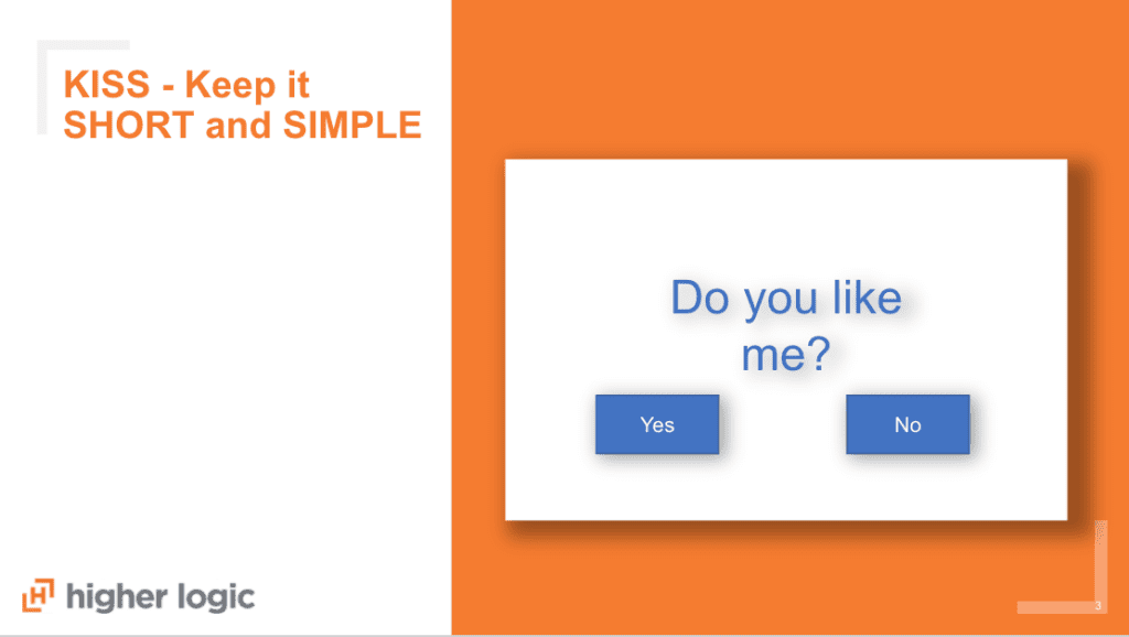
You probably won’t send a childhood note like this one to your subscribers, but the principle is the same. When you’re writing emails, keep in mind the one takeaway you want subscribers to have (that’s right, one!), and be as clear and succinct as possible.
This applies to every aspect of the email, from subject line (keep it short!) to CTA (only two options!)
2. Use Preheaders to Complement Your Subject Lines
There are three elements subscribers usually see in their inbox: the subject line, the “from” name, and the preheader. All three work together to make an impression that determines whether or not you’ll get the open.
Preheaders are so underused, but they can really expand and complement your subject line.
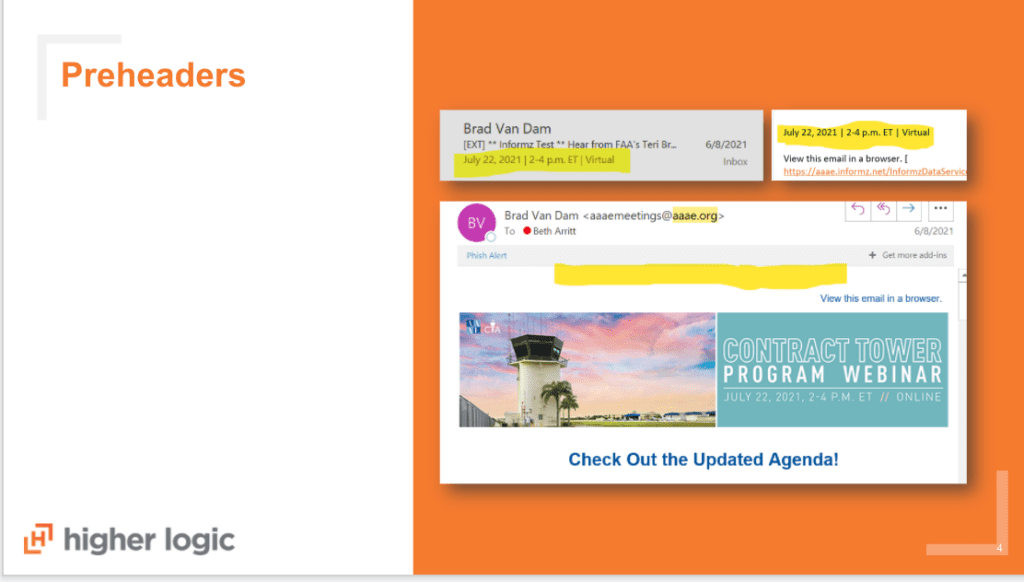
Take an event email, for example. You can add dial-in information directly to the preheader, or call out the date and time.
Your preheader will always be the first line of text in your message. You can choose that to be visible when someone clicks through, or you can hide it by making the font the same color as your email background, which will show up in the inbox but not in the email itself. (Though anyone using the plain text version or dark mode might be able to see it.)
3. Build Continuity Between Emails and Website Design
Your email campaigns are an extension of your brand, so you want to make sure it’s consistent with your website – especially the landing page you’re sending your subscribers to. If your website uses specific icons, images, or colors, you want to make sure you use the same elements in your emails.
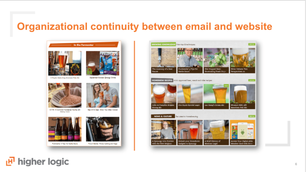
Take the email above as an example. You can see how the images look similar between the website and the email, so your audience can easily identify the specific content they’re looking for.
This helps create a seamless member experience. If your members want to find professional development, use the same colors on your website and your navigation in your emails for that information. The more familiar you can make it, the more easily members can get the information they need.
4. Personalization Brings Visualization
When you send emails, you’re offering a window for your audience to picture themselves joining your community, attending an event, or furthering their career. Psychologically, if you can picture yourself in a place or doing a particular activity, it’s much more likely you’ll actually take the leap.
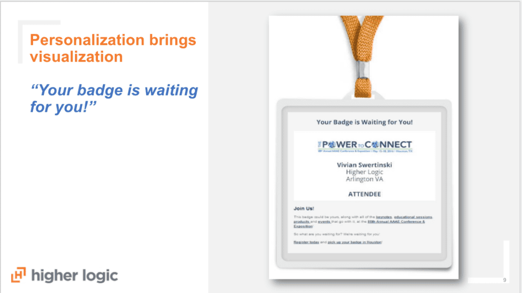
Personalization is a great way to do this. For an event, one way to do this is to include a personalized badge like in this email. (Though be careful to make the fine print very clear — one time someone showed up to an event thinking the email was his actual badge.)
5. Give Your Audience the Help They Need
Putting your members at the center of everything you do means you should know what information they need, when they need it. What takes them from thinking about joining your association to becoming an active volunteer? What do they need to provide to their organization to get them to your event?
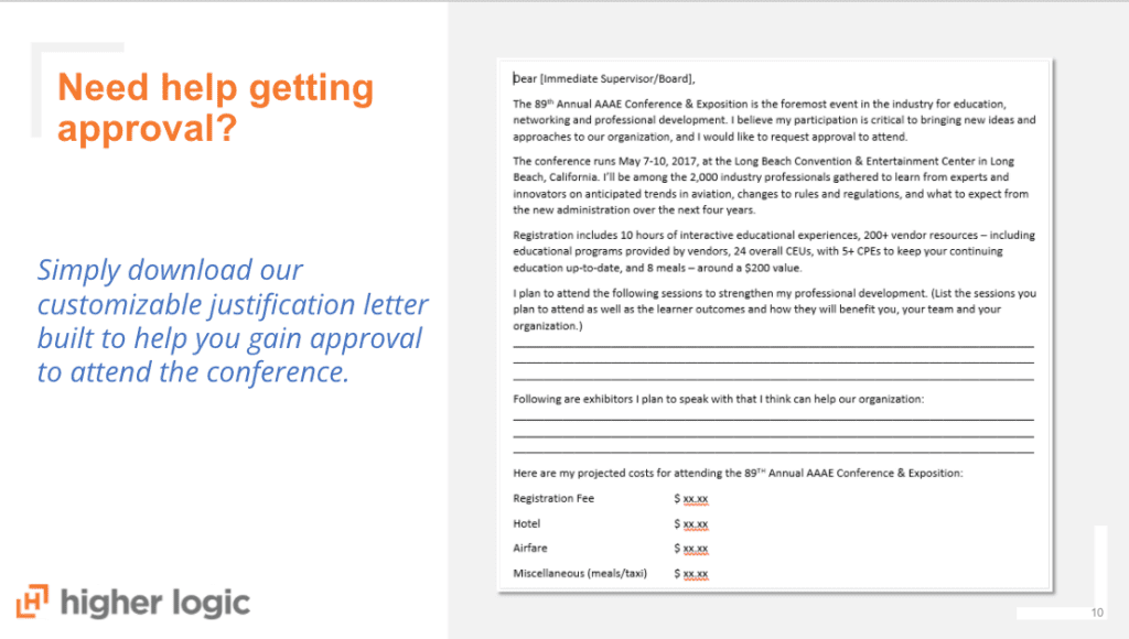
Email is a great way to facilitate this information. Chances are your prospects and members likely need approval from their manager before they can sign up for a conference. This campaign included a justification letter for attending events — so all they need to do is fill it out and send it to their supervisor or leadership team.
It works well for conferences, but also for anytime someone needs approval to spend money, like membership or sponsorship exhibits. You don’t need a long, expensive process – just make them something they can download and share easily. The more helpful it is, the more likely you’ll both win.
6. Own Your Oops
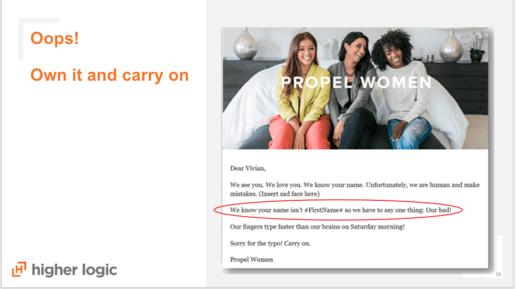
This has happened to all of us. (And it will probably happen again.)
Whatever the mistake is, own it and carry on. Acknowledge the mistake with an apology email if needed, but don’t beat yourself up – although, if you do decide to send a second email, it might be best to wait a day to avoid affecting email deliverability. (More about that here from Amanda DeLuke.) If it’s an important link issue, you can easily change it with an emergency link change by doing a redirect on that tracked link.
7. Include Two Calls to Action

Include at least two calls-to-action or CTAs in every email.
You want people who are ready to commit to purchase, but if they’re not, give them an option to learn more, too. If they’re not quite ready to buy, they can still convert on your email. What’s their next best step?
Here’s the secret: even if both of those CTAs go to the exact same page, that person won’t feel pushed to do one thing or the other, and can decide for themselves. Not everyone is going to want to make a purchase from one email – it can take time.
This also gives you more data on the readiness of your subscriber and you can drop them into a nurture flow based on their selection
8. Automate, Automate, Automate
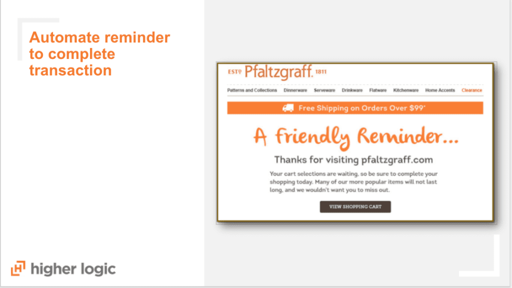
Why make things harder for your team? Think about automating:
- Reminders to complete transactions. We’ve all received an abandoned cart email from retailers. The same principle holds true for membership, too. Automating a quick, friendly reminder can be just the thing that nudges someone into finally joining your organization.
- Triggers on website behavior. If someone downloads a piece of content, send them an automatic email. Or if they went to several different pages on your conference website, send them a note about attending.
- Recommendations on next steps. Based on what they’ve already purchased, give them a way to go deeper. For example, if they’ve already attended one course, what should be the next item in their curriculum for their professional development?
All year long, no matter what other campaigns are running, these automations humming along in the background can give your association a successful foundation to add value for your members and increase your revenue.
9. Be Mobile Friendly
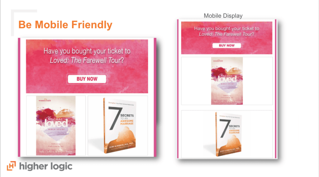
More of your audience may be reading your emails on their phone than on their computer (find this out by looking at your data). You want to make sure every email is mobile-optimized. You can do that by including a version with a mobile display, which stacks images and content blocks to make it easier to scroll.
A lot of email marketing systems allow you to create separate emails or different images for mobile, but you can also just design one email with mobile readers in mind.
10. Test Everything (Then Test It Again!)
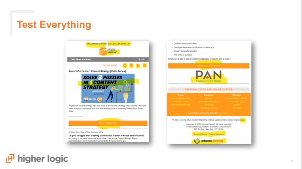
When I say test everything, I really mean test everything. Even the links and elements you think are fine because you’ve already tested your template.
I once copied and pasted our customer service number directly from an email from someone in sales. When I called that number to test it…let’s just say that phone number led to an advertisement for a less-than-family-friendly establishment thanks to the wrong area code. Totally embarrassing!
Before every send, make sure you test it (and then test it again.)
Optimize Your Email Campaigns with Our Checklist
This list is just the beginning of optimizing your email marketing program. Download our email optimization checklist — with over 30 tips! — so you can dot your i’s and cross your t’s on every single campaign


